Designing for Growth in EdTech
Easy-Tutor
Role: UX / UI designer
Context: EdTech Platform Optimization
Duration: 08-2021 to 10-2023

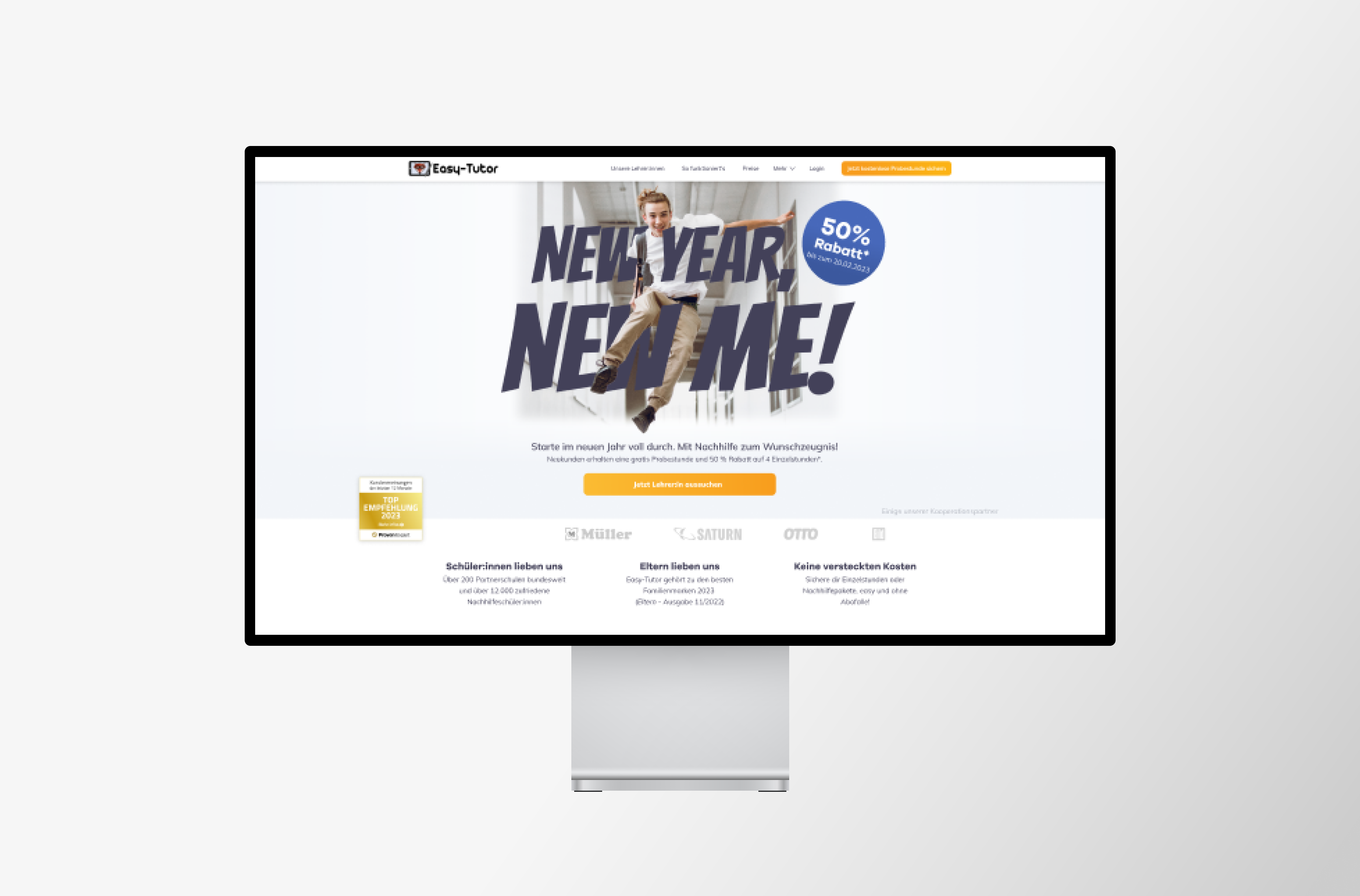
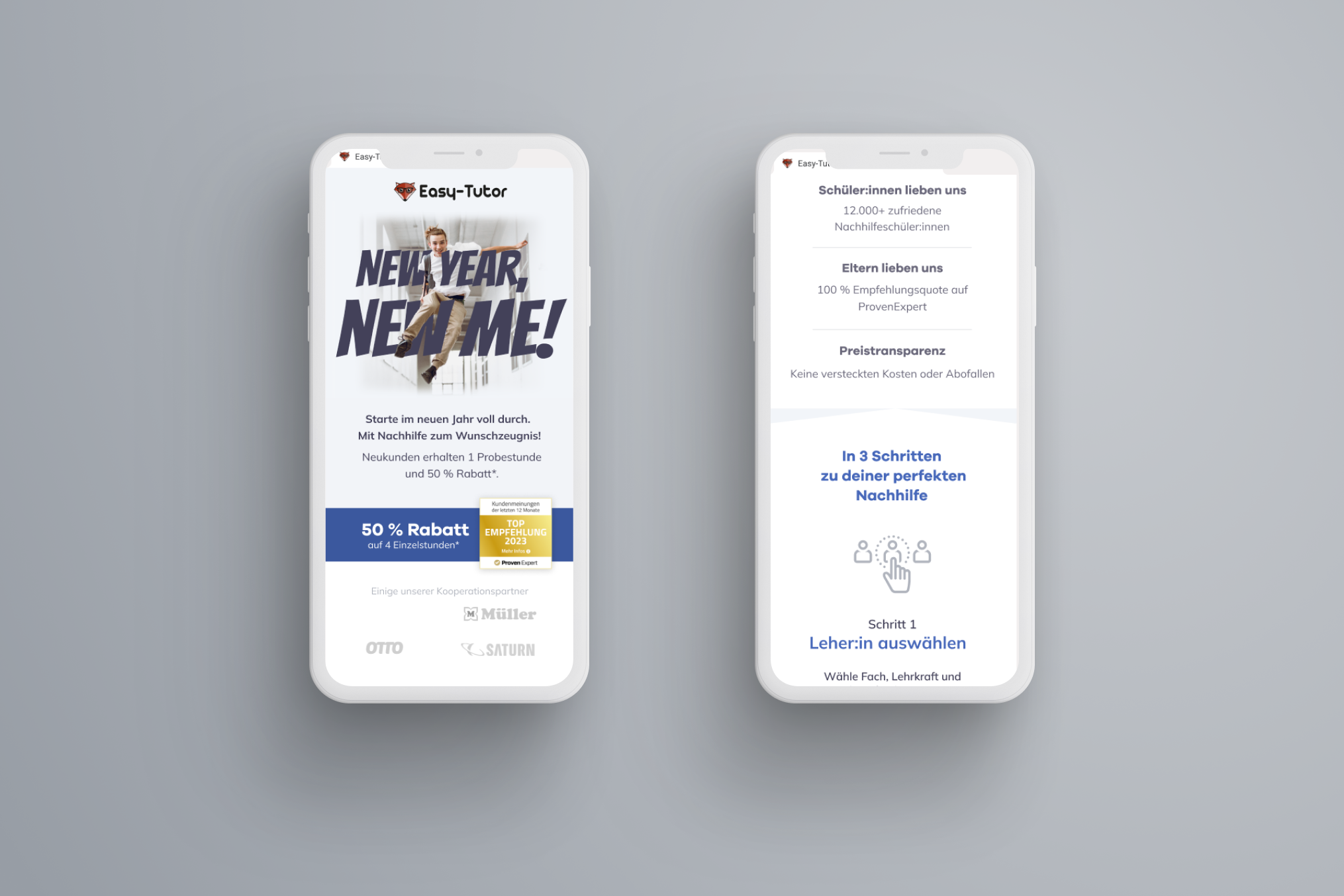
Number of Sign-ups Plummets after Login Page Redesign?
What's this about?
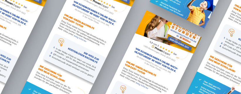
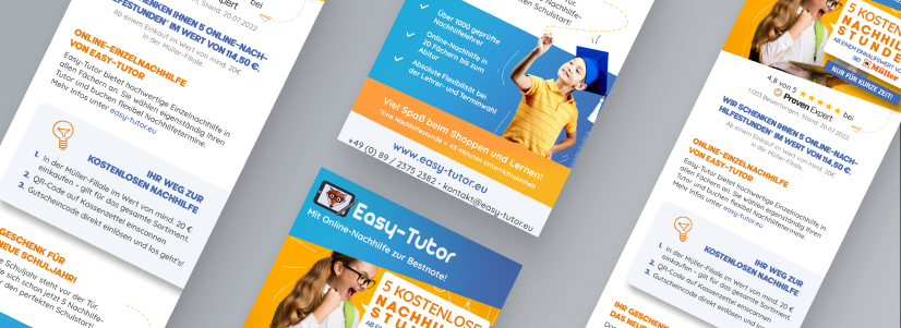
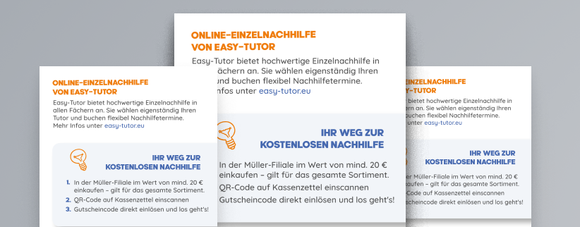
Easy-Tutor is a German tutoring platform in a crowded market, so delivering a smooth, appealing experience is crucial to standing out.
As the only designer on a 2-year project, I teamed up with engineers to make the platform more user-friendly and visually engaging.
By focusing on the overall interface and user journey, I helped boost user satisfaction and retention, supporting the company’s growth.
01
Discover
Targeted Research Questions
To identify key USPs for the new brand and understand user expectations, I analyzed competitors, reviewed surveys, and distributed user surveys to local parents.
Collaborating with marketing and sales, we used this data to map out the features relevant to our key user groups - mothers of students working towards their "Abitur".
Based on the results, I decided to emphasize "modern technology" on the marketing pages, whereas for signed-up users, a quick and easy booking process was key.
I recognized the need to design for both convenience and transparency, aligning with user expectations.
Teamwork makes the dream work
To find out what power users struggle with, I talked to customer support and product management. They shared helpful insights based on real user feedback.
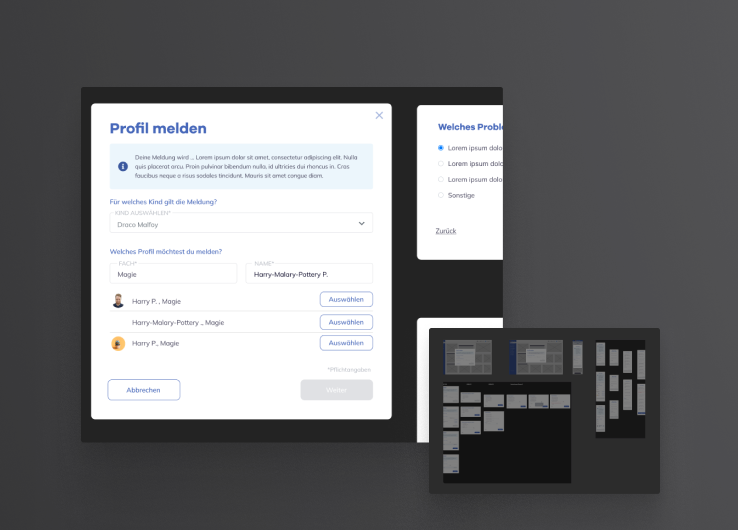
Along with those departments and the C-level, we decided to improve the calendar booking feature, add a way for users to report bad tutors, and take a step back from the tablet rental feature since it wasn’t popular.
By involving the team in this process, I ensured everyone had a voice, and eventually helped me understand our users' priorities better.
Guerilla
Neighbor Usability Testing
To identify problems with the platform, I conducted guerilla usability testing with a neighbor, who tried to sign up and book a tutor.
While observing, I took notes on where she faced difficulties and created a flowchart to get an overview of all steps a user in the role of a parent takes.
This revealed areas where we could make signing up easier and improve tutor search features.

Gathering Feedback
Design Presentation
After implementing changes, I shared the results with the team, showcasing both before-and-after comparisons to highlight improvements.
The feedback we received from stakeholders showed that our changes made the platform more user-friendly.
In the end I was able to gather both qualitative insights and quantitative data to demonstrate our project's success.
02
DEFINE
Getting all ducks in a row
In this phase, the main focus was to address critical user pain points and align our efforts with business goals.
After analyzing user insights, we prioritized solving the issues of reporting malicious users and streamlining the signup process, as these directly impacted user satisfaction and platform usability.
I presented comprehensive prototypes to C-level executives, sales, marketing, and IT teams to align on these priorities.
During these sessions, I showcased an improved user flow that highlighted the redesign of tutor filtering and the calendar feature, ensuring the user could focus on essential jobs to be done.


First things first
Each change was documented either in Confluence, as a backlog item, or immediately turned into a detailed ticket, specifying problem statements, user stories, and desired outcomes.
While C-level executives prioritized urgent features like reporting malicious users, collaboration with the IT team determined the timing and order of other improvements based on resource availability and feature dependencies.